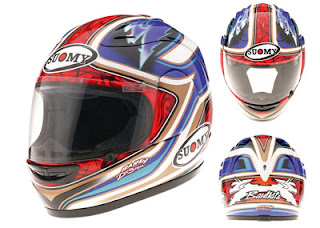
Lid & Livery – A Short Rant

It’s not exactly news that Alvaro has switched helmet suppliers for 2008 (from NZI to Suomy) nor that the new graphic design is different from that on his 2007 lid; these have been covered on various websites (notably, first, on www.batifans.com of course) over the past days. Indeed you can already buy the replica from Suomy and its distributors – I’ve even seen a couple on eBay.
Nonetheless I just fancied wittering on about it for a short while anyway, being a designer by trade and being interested in liveries and branding and all that malarkey.
2008 really represents quite a step-change in Alvaro’s ‘kit’ – far more so than his first season in 250cc. This is largely due to the imposition of the Mapfre branding on the 250cc squad’s bikes and leathers this year. Whilst the 125cc squad retain the blue variant livery (with the secondary flouro colours; magenta for Gabor Talmacsi, yellow for Sergio Gadea and orange for Pere Tutusaus) the 250cc has gone totally red and white for the pre-season testing at Jerez and Valencia.
‘Red and white’ actually means predominantly red, and particularly so on the bike.
I have to admit openly that I much prefer the previous blue/white combos (plus the orange flashing that Alvaro has used). The red and white just looks very cold and corporate by comparison…. who knows, maybe it’ll grow on me – but it hasn’t yet…
And on top of that (literally) is Bati’s new helmet.
Here I’m unequivocally of the opinion that last year’s (and those before it, which seemed to have a kind of evolutionary style about them – you could see the design developing from one year to the next) was hugely better. And here’s why…
I think that crucially there are some stylistic touches that make things look more sleek and aerodynamic – that bring things to life beautifully, and some others that make things look like a brick.
Unsubtle as they were (or *are*… they’re probably still popular in Lincolnshire…) “speed stripes” undeniably added a stylised ‘swoosh’ to the sides of a car, and with it an effect on exaggerating length and emphasising speed and sleekness – and their descendants; various arrows, flames, celtic curves and whatever – have continued to develop that theme for better or worse.
These touches tend to work best when they emphasise the horizontal, when they flow a design along a surface or around a shape.
Alvaro’s 2007 helmet (even though you could argue that some of the design detail may have been overly intricate) was a beautiful example of a graphic design that flowed perfectly across and around the contours and curves of the helmet. It made a functional piece of gear look sculpted and elegant.
If a design does not flow horizontally it is in danger of drawing the eye to a complete halt. Sharp inclines, thick blocks and vertical elements tend to do this spectacularly well. And guess what – Alvaro’s 2008 helmet design (by Bargy Design) does exactly this and, although I can admire the slightly simpler approach to the overall stylings, it feels undeniably blocky and less flowing. It looks less aerodynamic. And even though it includes very modern executions of certain swashes and a (less than successful) reinterpretation of Alvaro’s mischievous devil mascot, it looks decidedly old fashioned and clunky.
I’m sure some people will love it – very probably lots of people; but so far it’s really not growing on me at all, and I do feel it’s a disappointment given how cool Bati’s 2007 lid was.
I’m not convinced of the rightness of making the mischievous devil a lot more sinister either; the take on the devil mascot always having been that it’s not serious in any sense but reflects a kind of naughty side rather than a dark side of Alvaro’s character. While he may have the face of an angel he certainly rides like a little devil.
And don’t we love that 🙂
But the new graphic treatment seems to take this too seriously and loses any kind of cartoony, fun aspect (and if you think you can’t be both brilliant AND have a cartoon mascot then you’ve clearly never heard of Ayrton Senna).
Anyway – rant over; I’m a grumpy old git and much as I believe Bati should employ me as his brand advisor (and all kinds of other jobs too), this is when all’s said and done, no more than a very subjective little take on the whole lid & livery 2008 subject.
If nothing else I hope it’s been an interesting diversion for a few minutes… 😉
gb


